CASE STUDIES
CONTENT STRATEGY & IA
Restructuring an HR Consulting Website to Improve Service Discovery
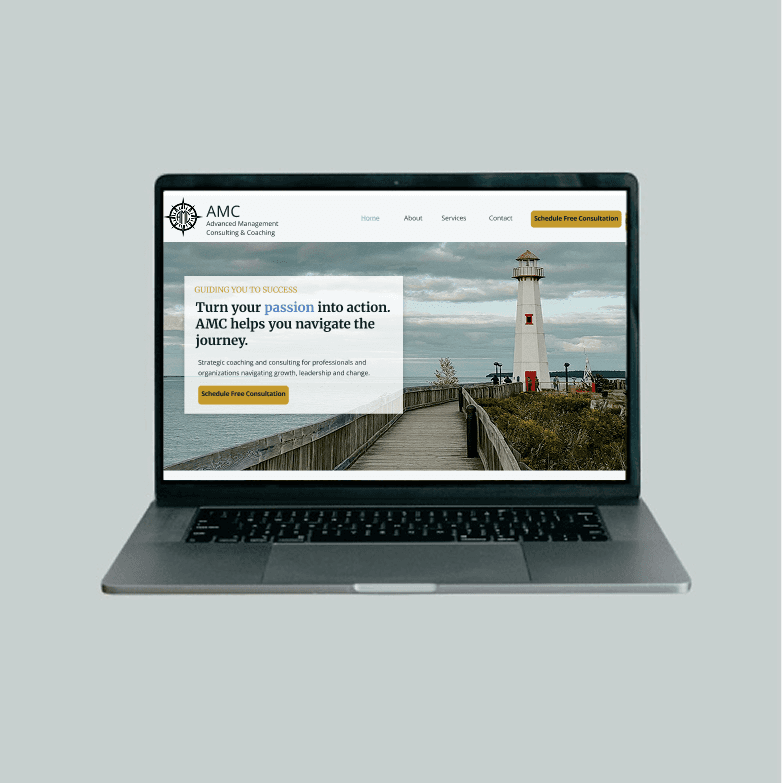
Simplified a complex consulting website by restructuring content, navigation, and messaging to help prospective clients find services faster and take action with confidence.
MY ROLE
Content Strategist & UX Designer
PLATFORM
Figma (design), WordPress (planned)
TIMELINE
May 2026 - present
AUDIENCE
Professionals, Leaders, Teams, and Organizations
DELIVERABLES
Content Strategy, User Flows, UX Writing, Optimization
OUTCOME
Improved service discoverability and consultation pathways
OVERVIEW
AMC's website contained valuable content, but the information architecture and navigation made it difficult for prospective clients to understand services and take action. The project focused on simplifying the content structure, improving discoverability, and creating a clearer path from service exploration to consultation.
CHALLENGES
Service information was spread across multiple pages with overlapping content.
Navigation did not clearly support user goals or decision-making.
Testimonials and FAQs were separated from the content where users needed them.
The primary consultation call-to-action lacked visibility.
The structure was difficult to scale as services evolved.
PROCESS
Conducted a content audit to identify duplication, outdated information, and opportunities to simplify the site structure.
Evaluated navigation patterns and content relationships to understand how prospective clients explored services and moved through the experience.
Redesigned the information architecture by consolidating related services into a more scalable and user-centered structure.
Created wireframes to test content hierarchy, navigation, and key conversion pathways.
Developed high-fidelity concepts that translated the content strategy into a clear, actionable experience for future WordPress implementation.
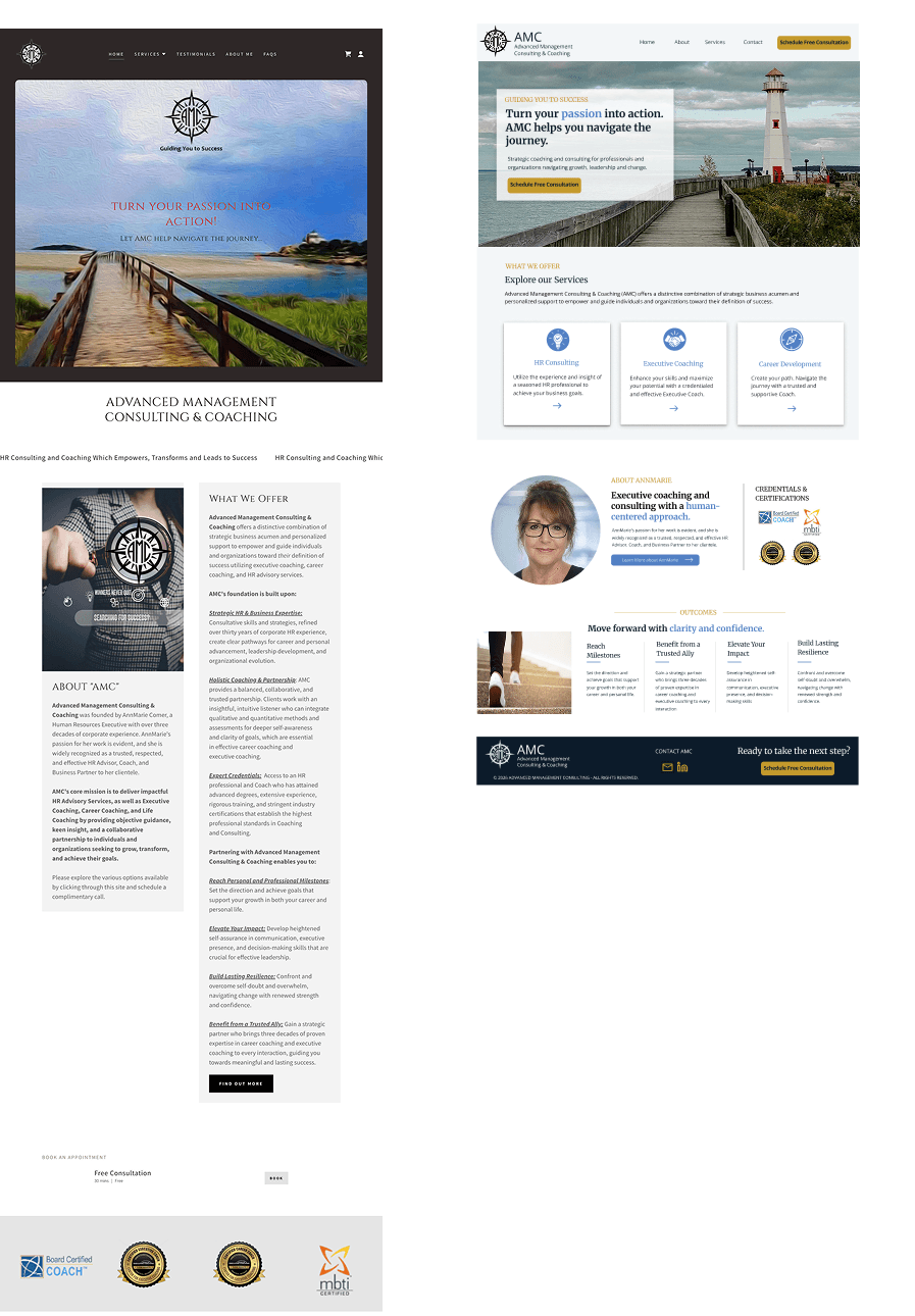
BEFORE
Primary consultation call-to-action was difficult to find
Service information was distributed across multiple pages with inconsistent structure
Navigation did not clearly support user goals or decision-making
Limited visual hierarchy made key information difficult to scan
Messaging lacked consistency across service offerings
Existing site did not effectively communicate AMC's value proposition
AFTER
Elevated consultation calls-to-action throughout the user journey
Simplified site structure with clearer pathways to services and resources
Reorganized navigation based on user needs and content priorities
Consistent page templates supporting easier content consumption
Improved messaging hierarchy emphasizing key offerings and outcomes
Modernized design concepts prepared for WordPress implementation
INFORMATION ARCHITECTURE
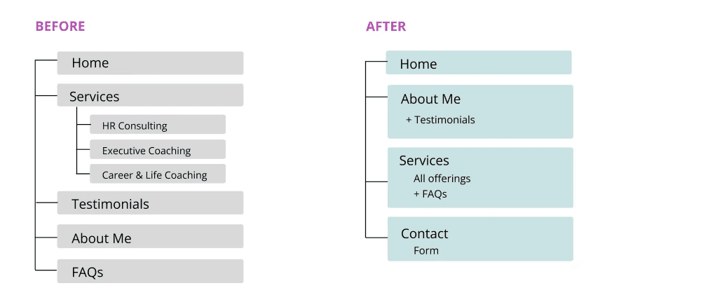
I restructured the site's content hierarchy to better align with how prospective clients evaluate consulting and coaching services. The original site contained multiple service pages with limited content, making navigation more complex than necessary. I restructured the information architecture around user needs, consolidating related content and creating clearer pathways for visitors exploring services, credibility indicators, and consultation options.
KEY DECISIONS
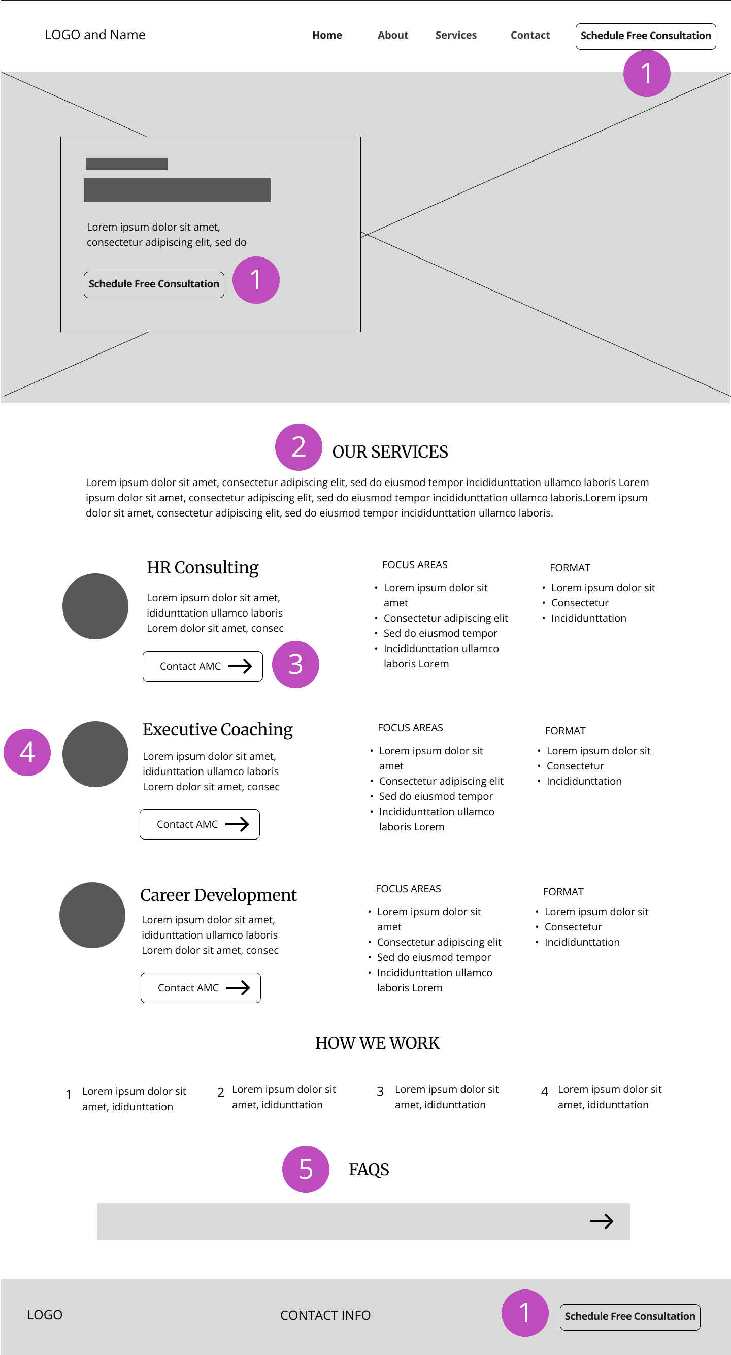

Increased conversion visibility
Elevated the "Schedule Free Consultation" call-to-action from a lower-priority homepage element to a highly visible action throughout the site.

Consolidated service content
Combined three lightly populated service pages into a single structured experience, reducing navigation complexity and making it easier for visitors to compare services.

Designed for future growth
Created a flexible content structure that supports future service expansion. As offerings grow, individual services can be expanded into dedicated pages and linked through "Learn More" pathways without requiring a redesign.

Improved content recognition and scanability
Used consistent icons on the homepage and Services page to create a stronger connection between service summaries and detailed descriptions. This helped visitors quickly recognize offerings and navigate content more easily.

Improved content relationships
Rather than keeping FAQs and testimonials on separate, dedicated pages, I integrated them into the areas where they were most relevant. FAQs were moved into the Services experience to support decision-making, while testimonials were incorporated into the About page to reinforce credibility alongside AnnMarie's experience and qualifications.
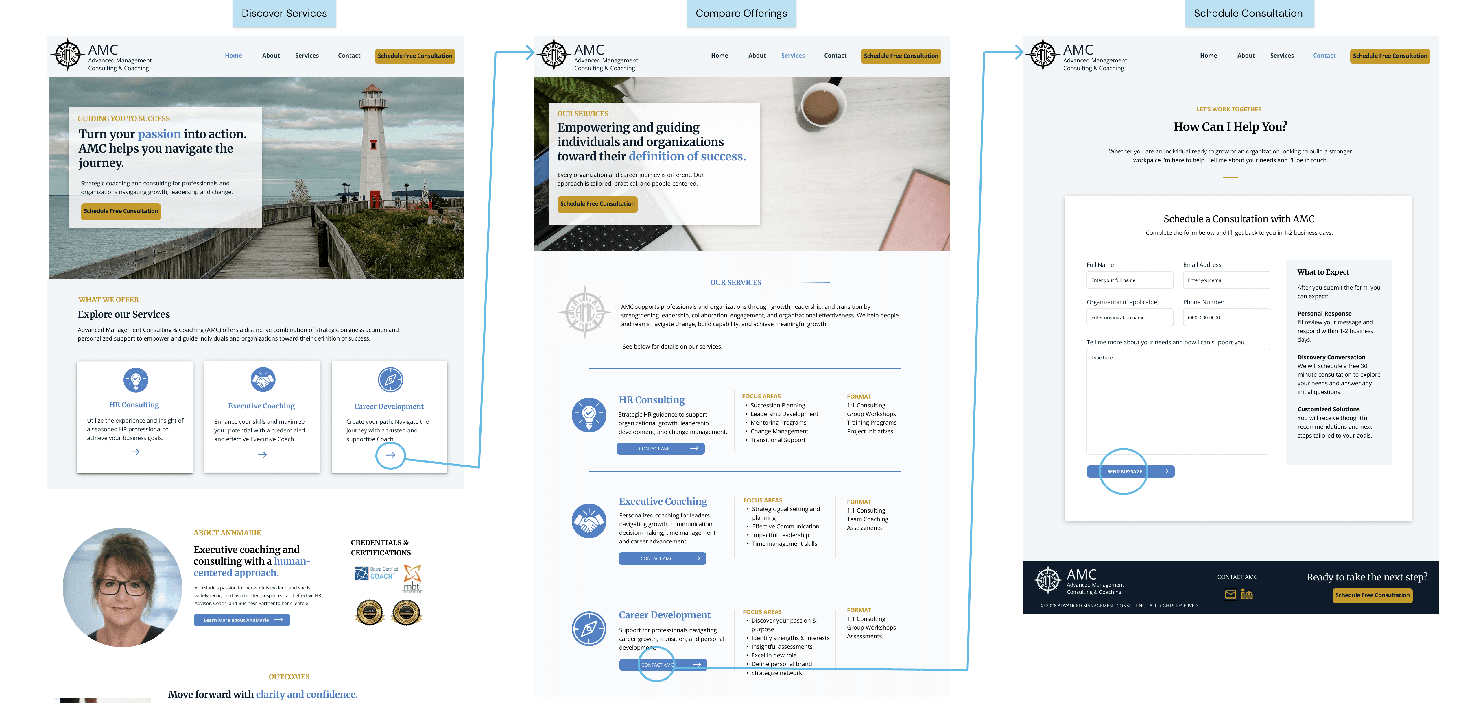
USER FLOW EXAMPLE
The redesigned experience creates a clearer path from service discovery to scheduling a consultation. Visitors can quickly explore services on the homepage, compare offerings within a consolidated Services experience, and schedule a consultation through a dedicated Contact page.
OUTCOME
Simplified service discovery by consolidating 3 service-specific pages into a single scalable information architecture.
Reduced navigation complexity by consolidating content across multiple standalone pages into a more focused site structure.
Established a clearer content and navigation framework for prospective clients
Created a dedicated consultation pathway through improved calls-to-action and a new Contact experience
Delivered a scalable foundation that supports future content growth and service expansion
Developed high-fidelity page concepts approved for WordPress development (in progress)