
FINANCIAL & REGULATED CONTEXT DESIGN
Consolidating Institutional Websites into a Scalable Content System
Unified multiple legacy institutional sites into a single global platform by redesigning information architecture, navigation, and content structure to improve findability and usability.
MY ROLE
Lead UX Content Designer
TIMELINE
Nov. 2020-Jan. 2021
AUDIENCE
Investors and Consultants
DELIVERABLES
Content Audit & Strategy, IA, Migration Planning, Content Governance
OUTCOME
Unified content across sites through a scalable information architecture
OVERVIEW
Following a merger, Amundi US needed to consolidate 2 legacy institutional websites into a single global experience. The institutional site served a global audience of investors and consultants reviewing products across a $100 billion AUM platform.
Rather than simply combining content, I focused on redesigning the information architecture and navigation to create a clearer, more structured experience for users. Content was developed within an established enterprise design system using approved typography, color standards, and page templates to ensure brand consistency and compliance across the site.
CHALLENGES
Conflicting legacy structures and labels
Content duplication and complexity
Platform and compliance constraints
GOALS
Consolidate multiple sites into one unified experience
Improve navigation and content findability
Align with the global platform, governance and design system
BEFORE
Multiple legacy websites with inconsistent navigation and structure
Investment content organized differently across sites, making comparison difficult
Fragmented user journeys with no clear path from overview to detailed strategy content
Dense, text-heavy pages that made key information difficult to scan
Content spread across multiple sites with overlapping or duplicated information
AFTER
Unified global platform with consistent navigation and page structure
Standardized strategy pages enabling easier comparison across offerings
Clear pathways from high-level overviews to detailed investment content
More scannable, structured content using modular components
Consolidated content into a single structured system, reducing duplication and improving clarity
INFORMATION ARCHITECTURE
I defined a unified information architecture to consolidate content from multiple legacy sites into a single, structured experience.
The information architecture supports both exploration and comparison by organizing strategies into a structured grid and maintaining consistent page patterns across detailed views.
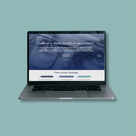
Content Structure: From Product Overview to Strategy Detail

KEY DECISIONS
I approached this project as both a content strategy and information architecture challenge, focusing on how investors and consultants find, understand, and navigate information. This flow illustrates how the structure supports multiple entry points and enables users to move between overview and detailed strategy content.

Defined a clear navigation framework within a global design system
Aligned content structure within the global platform while maintaining consistency and usability across regions.
Structured content to support both exploration and comparison
Organized information so users could move from high-level insights to detailed strategy content with minimal friction.
Use the hero as a gateway
Rotated key content to highlight insights while guiding users to strategies, ESG, and firm information.
Introduced clear calls-to-action to guide deeper engagement
Helped users navigate from overview content to detailed strategy pages more effectively.
Standardized strategy presentation for consistency
Created repeatable page structures that made it easier to compare offerings across categories.
Integrated compliance content without disrupting the experience
Balanced regulatory requirements with usability by embedding disclosures in a way that supported readability.
Supporting Design Decisions:
Audit and consolidate existing content
Reviewed content across legacy institutional websites to identify duplication, outdated information, and opportunities to streamline the user experience.
USER FLOW EXAMPLE
User Flow to Explore Featured Content
Investors and consultants arriving on the homepage needed a fast path to relevant content without having to browse through navigation. The hero carousel solved this by rotating high-priority topics like ESG initiatives, thought leadership, and sponsorship updates, with each linking directly to deeper pages. Users could either engage with featured content immediately or access via the top menu bar. The diagram below shows both paths.
Homepage Hero as Entry Point to Key Content

OUTCOME
Consolidated 2 legacy institutional sites into a single unified platform, standardizing presentation across approximately 20 investment strategy pages.
Improved navigation clarity across complex investment content
Created a scalable, standardized structure aligned with platform and compliance requirements
Reduced content fragmentation across post-merger websites
Enabled more consistent and comparable presentation of investment strategies across the platform